
Have you ever landed on a website and immediately felt lost, unsure of where to go next? Effective navigation menus are essential in guiding users through a website, helping them find the information they need quickly and efficiently. Understanding what makes a navigation menu effective and how to design one that enhances the user experience and keeps visitors engaged is crucial. Identifying the key elements that contribute to creating navigation menus that not only look good but also perform excellently is essential.

Understanding User Needs
Knowing what your audience expects can be a great way of preparing for design. Conducting user research can provide insights into common navigation patterns and user preferences. Surveys, usability testing, and analyzing website analytics can reveal the most visited pages and the paths users take to get there. Knowing your audience’s goals allows you to prioritize the content and features they need most.
Considering user needs also involves evaluating the user journey. Different types of websites have different primary goals—whether it’s providing information, selling products, or showcasing a portfolio. By identifying these goals, you can structure your navigation menu to direct users efficiently toward their desired outcomes. For instance, an e-commerce site should prioritize categories like “Products,” “Sales,” and “Cart,” while a blog might emphasize “Latest Posts,” and “Categories”.

Simplicity is Key
One of the primary principles of effective navigation is simplicity. Overloading your menu with too many options can overwhelm users and make it difficult for them to find what they’re looking for. A clean, simple menu with a limited number of options can help users navigate more intuitively. Aim for a balance between providing enough choices to meet user needs and avoiding clutter.
Consider using broad categories to group related items together. For example, an e-commerce site might have main categories like “Men,” “Women,” “Kids,” and “Sale,” with subcategories under each. This hierarchy helps users drill down to more specific items without feeling lost in a sea of links. Additionally, using a minimalist design can enhance clarity. Avoid unnecessary graphics or animations in the menu, as these can distract from the primary task of navigation.
Logical Hierarchy
Creating a logical hierarchy within your navigation menu is important. Users should be able to understand the structure of your site at a glance. This often means organizing content into categories and subcategories that make sense from a user’s perspective. For instance, a travel blog might have top-level categories such as “Destinations,” “Travel Tips,” and “Gear Reviews,” with subcategories under each one.
Using dropdown menus can help maintain a clean design while still providing access to a larger number of pages. Ensure that these dropdowns are easy to navigate on both desktop and mobile devices, as poor mobile navigation can frustrate users and increase bounce rates. Additionally, the hierarchy should reflect the importance and frequency of use. Place the most critical and frequently accessed links at the top level, ensuring they are easily accessible.

Clear Labels
Use clear and descriptive labels in your navigation menu. Avoid jargon or overly creative names that might confuse users. Opt for straightforward terms that accurately describe the content. This is vital for SEO since search engines depend on these labels to grasp your site’s structure and content.
For instance, instead of a vague label like “Services,” use “Web Development” or “Graphic Design.” This not only helps users find what they need but also boosts your site’s search engine rankings. Clear labels also build user confidence by setting clear expectations for what they’ll find when they click a link.
Consistency
Consistency in navigation is another key aspect of user-friendly design. Users expect to find navigation elements in familiar places. This means placing the main menu at the top of the page or along the side, where it’s commonly found. Additionally, the design and layout of the navigation should remain consistent across all pages. This predictability helps users feel more comfortable and confident as they move through your site.
Consistency also applies to the visual design of the menu. Use the same colors, fonts, and styles for navigation elements throughout your site. This uniformity reinforces brand identity and ensures that users do not need to reorient themselves as they move from page to page.

Mobile Optimization
With an increasing number of users accessing websites on mobile devices, ensuring your navigation menu is mobile-friendly is essential. Responsive design practices can help your menu adapt to different screen sizes and orientations. For mobile navigation, consider using a hamburger menu (three horizontal lines) that expands when tapped, revealing the full menu options.
Keep mobile navigation simple and concise. Users should be able to tap through the menu without needing to zoom in or scroll excessively. Ensuring touch targets are large enough to tap easily can also improve the mobile user experience. Additionally, prioritize the most important links in the mobile menu to ensure they are quickly accessible.

Testing and Iteration
Creating an effective navigation menu requires ongoing testing and iteration. Use A/B testing to compare designs and see which performs better for user engagement and satisfaction. Gather feedback from users and make adjustments as needed.
Regularly review website analytics to understand user interactions with your menu. Look for patterns like high exit rates or frequent backtracking that indicate confusion. Continuously refine your navigation based on real user data to ensure it remains effective.

Accessibility
Accessibility is an essential aspect of navigation design. An accessible navigation menu ensures that all users, including those with disabilities, can use your website effectively. Follow web accessibility guidelines, such as the Web Content Accessibility Guidelines (WCAG), to create menus that are navigable via keyboard and screen readers.
Provide text descriptions for menu icons, use sufficient contrast for text, and ensure that all interactive elements are easily identifiable and operable. Not only does this make your site more inclusive, but it also enhances the overall user experience for everyone. Accessibility features, like ARIA (Accessible Rich Internet Applications) labels and focus indicators, can further improve usability for all users.
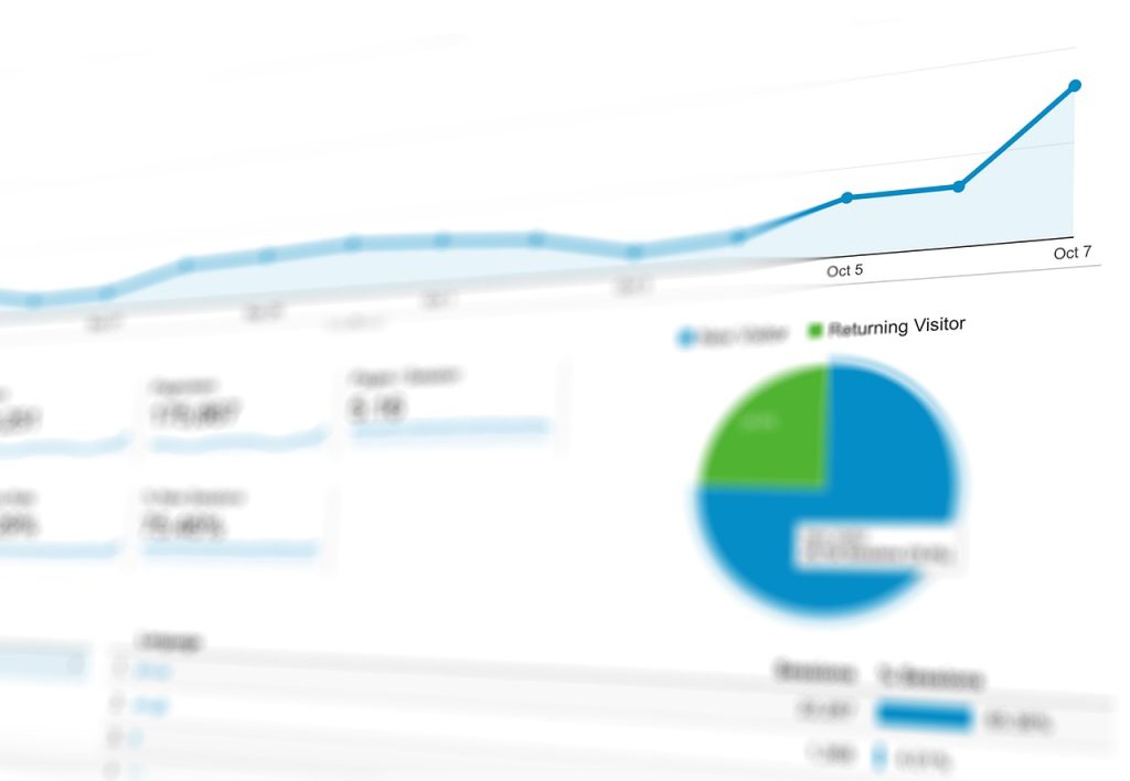
The Role of Analytics
Analyzing user interaction with your navigation menu provides insights into its effectiveness. Tools like Google Analytics show which items are most clicked, how long users spend on pages, and where they drop off. This data can guide menu adjustments and content prioritization.
For instance, if a subcategory is frequently clicked, consider making it a top-level category. If certain items are rarely clicked, reevaluate their placement or remove them. Regular updates based on analytics keep your menu relevant and user-friendly.
Real-World Examples
Looking at real-world examples can provide inspiration for your own navigation menu design. Websites like Apple and Amazon are often cited for their effective navigation. Apple’s website, for instance, uses a clean, horizontal menu with clear labels like “Mac,” “iPad,” and “iPhone,” each leading to detailed submenus. Amazon’s menu categorizes its vast range of products into intuitive sections, making it easy for users to find what they’re looking for despite the site’s extensive inventory.
It may be useful to review these examples can offer valuable lessons in balancing simplicity with depth. Pay attention to how such sites are able to offer a great deal of information while not overwhelming the user. This balance is achieved through thoughtful categorization, clear labeling, and consistent design.
Conclusion
Creating an effective navigation menu is key to enhancing user experience. Understand user needs, keep it simple, ensure clear labels and logical hierarchy, maintain consistency, optimize for mobile, test and refine regularly, and prioritize accessibility. Analyze user interactions and learn from successful examples to improve your menu. A well-designed navigation menu boosts user satisfaction and helps achieve website goals like increased traffic and higher conversion rates.
Need help with your website design? Contact us today!