Portfolio: Zimbra

Client
Zimbra by Synacor
Industry
Open Source Email Provider, SaaS
About project
Project Information
Zimbra is a comprehensive collaboration suite that provides a unified platform for email, calendar, contacts, tasks, and messaging. Designed for businesses and organizations of all sizes, Zimbra offers a range of features that enhance communication and collaboration, ensuring seamless workflow and productivity.
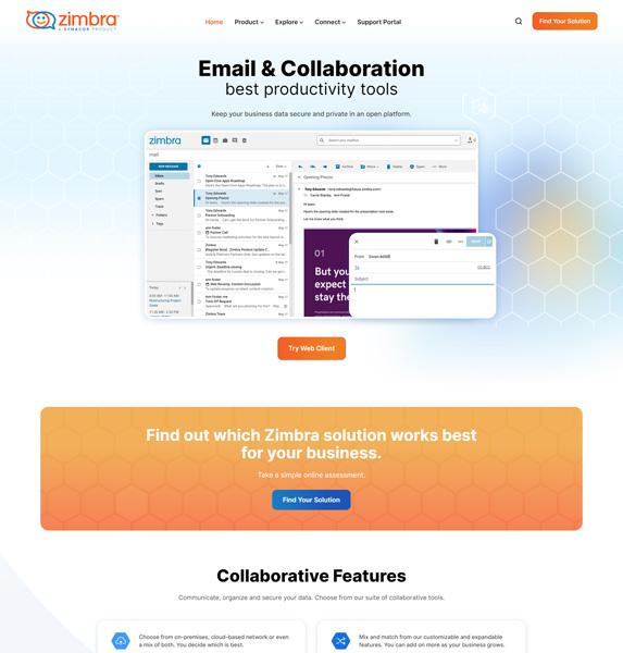
Our team embarked on an extensive web design and development project for Zimbra, aiming to revamp their online presence with a brand-new look and feel. The primary objective was to enhance the user journey and integrate website features that significantly improve usability and attract leads. This transformation involved creating a modern, visually appealing design that accurately reflects Zimbra’s brand identity and values. Additionally, we focused on restructuring the website’s navigation to provide a seamless and intuitive user experience. By implementing advanced features and interactive elements, we aimed to ensure that visitors could easily understand and engage with Zimbra’s services.
The project required a deep understanding of user behavior and the latest web design trends to create a platform that not only attracts but also retains visitors, ultimately converting them into leads. Our comprehensive approach combined innovative design with robust development practices to deliver a high-performing website tailored to Zimbra’s business needs.
The Challenges
Unattractive User Interface: The existing website had an outdated and visually unappealing design, which failed to engage users and did not reflect Zimbra’s dynamic brand. This lack of visual appeal was a significant barrier to retaining visitors, leading to high bounce rates and poor first impressions.
Messy User Journey: The website’s navigation structure was confusing and cluttered, resulting in a disjointed user experience. Users struggled to find relevant information easily, leading to frustration and abandonment. This poor user journey hindered effective interaction with the site and negatively impacted user satisfaction.
Lack of Focus Point: The service page lacked clear focal points and concise information, making it difficult for users to quickly grasp Zimbra’s offerings and their benefits. This lack of emphasis and clarity resulted in missed opportunities for lead generation and a failure to effectively communicate the value of Zimbra’s services.
Results
The Zimbra web design and development project yielded significant improvements across multiple aspects of their online presence. The newly designed user interface transformed the website into a visually appealing and engaging platform that effectively represents Zimbra’s brand. The enhanced navigation structure provided a seamless and intuitive user journey, which reduced bounce rates and increased user engagement. The service pages were redesigned with clear focal points and detailed information, enabling users to quickly understand Zimbra’s offerings and benefits. These changes led to a substantial increase in lead generation and conversion rates, as users found it easier to navigate the site and access relevant information. Overall, the project successfully created a user-friendly, aesthetically pleasing, and high-performing website that supports Zimbra’s business goals and enhances customer satisfaction.
Solutions
- Brand New Website Look & Feel
- Streamlined Navigation
- Improving User Journey
- New “Find Your Solution” Feature
- Responsive Design
- Optimizing for Lead Generation
Why iCreationslab
By choosing us, you’re partnering with a team dedicated to transforming your vision into a dynamic, high-performing website that drives success for your business.
Latest from Blog
Fusce dignissim blandit justo, eget elementum risus tristique. Nunc lacus lacus, sit amet accumsan est pulvinar non. Praesent tristique enim lorem.
[blocksy_posts limit=”3″ has_pagination=”no”]
