Have you ever noticed how some websites immediately draw you in, while others just don’t stand out? One of the key elements that play a crucial role in web design is color. Color isn’t just a decorative element; it has the power to influence emotions, convey messages, and impact user behavior.

The Psychology of Color
Colors have a profound psychological impact on humans. Each color can evoke different emotions and associations, which can significantly affect how users perceive a website. For instance:
Red is often associated with energy, passion, and urgency. It can be used to grab attention and stimulate excitement, making it ideal for call-to-action buttons. According to Psychology Today, red can “increase heart rate and create a sense of urgency” which is why it’s commonly used in clearance sales.
Blue conveys trust, calmness, and professionalism. It’s a popular choice for corporate websites and businesses that want to establish a sense of reliability. Entrepreneur magazine notes that blue is “often used by banks and businesses because it symbolizes trust and security.”
Green symbolizes growth, health, and tranquility. As Color Psychology explains, green “has a strong association with nature and can evoke feelings of tranquility and calm.”
Yellow exudes happiness, optimism, and warmth. It can draw attention and create a sense of cheerfulness, but should be used sparingly to avoid overwhelming users. The Interaction Design Foundation points out that yellow is “attention-grabbing but can be straining to the eyes if overused.”
Black represents sophistication, elegance, and authority. It’s often used in luxury brands and high-end products to create a sense of exclusivity.
Establishing Brand Identity
Think about the ability to identify a brand simply by colors; that is the effect of the proper selection of the color scheme. It is a known fact that color is one of the most effective tools to create and remind brand image. With proper utilization of brand colors the feel and looking of a website is proper and recognizable to the brand. For instance, the pair of colors red and white found in most of Coca-Cola’s advertisements or the blue color predominantly featured in most of Facebook’s images. Of course, none of these colors is chosen by mere coincidence as each is in some way an embodiment of the brand’s character.
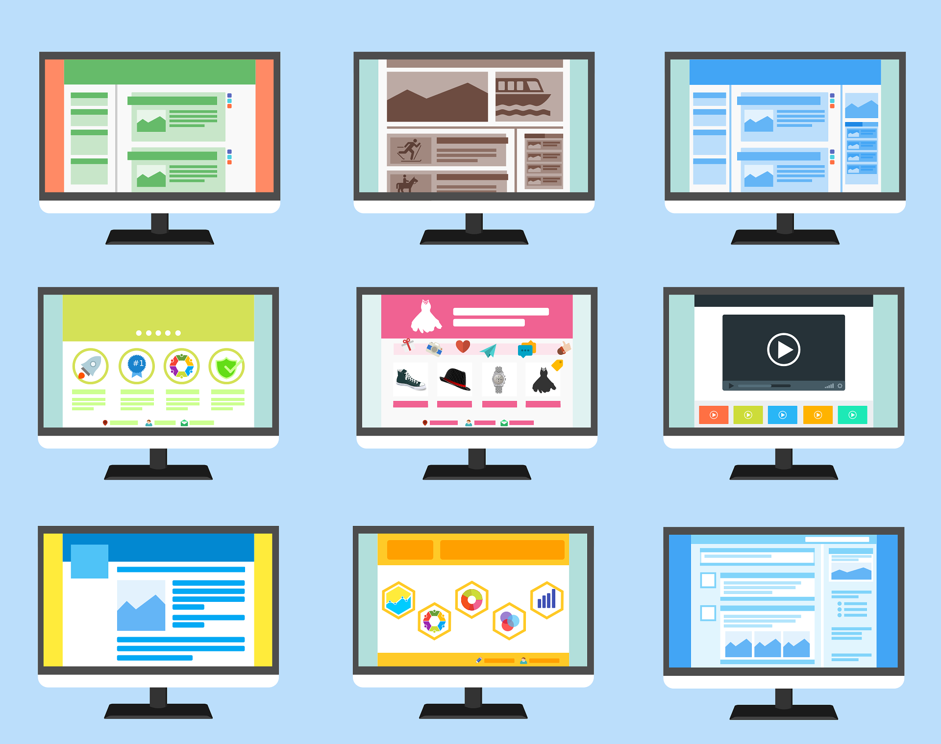
When designing a website, it’s important to select a color palette that reflects the brand’s identity and resonates with the target audience. This involves choosing primary colors for the main elements, secondary colors for highlights and accents, and neutral colors for backgrounds and text. Tools like Adobe Color can help designers create harmonious color schemes that enhance the brand’s visual identity.

Enhancing User Experience
Colors are not just for aesthetics; they’re essential in creating a seamless and enjoyable browsing experience. Imagine your favorite website—its use of color probably guides your eyes to where they need to go, making the whole experience feel effortless. By strategically using colors, designers can create visual hierarchy, emphasize important elements, and facilitate navigation
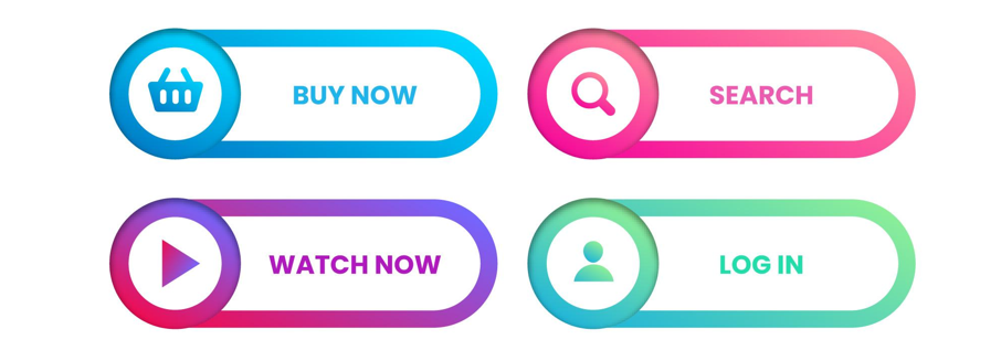
- Call-to-Action Buttons: These buttons should stand out from the rest of the page. Using a contrasting color for call-to-action buttons can draw users’ attention and encourage them to take desired actions, such as signing up for a newsletter or making a purchase.
- Readability: Ensuring text is readable is essential for a good user experience. This involves selecting colors with sufficient contrast between text and background. Dark text on a light background is typically the easiest to read, while light text on a dark background can also be effective if done correctly.
- Navigation: Colors can be used to differentiate various sections of a website, making it easier for users to navigate. For example, using different background colors for headers, footers, and main content areas can create a clear structure and improve user flow.

Emotional Engagement and Conversion
The right color choices can enhance emotional engagement and increase conversion rates. Emotional responses to colors can influence purchasing decisions and brand loyalty. For instance, a website designed for a children’s toy store might use bright and playful colors to create a sense of fun and excitement, encouraging parents to make a purchase.

Additionally, A/B testing different color schemes can provide insights into how color affects user behavior. By experimenting with different button colors, background hues, and accent shades, designers can identify which combinations lead to higher conversion rates and better user engagement.
Here are two useful tips for leveraging color to boost emotional engagement and conversion:
Tip 1: Use Contrasting Colors for Calls to Action
Ensure that your call-to-action (CTA) buttons stand out by using colors that contrast with the background. For example, if your website has a predominantly blue color scheme, using an orange or red button will make the CTA pop. This visual distinction draws the user’s eye directly to the action you want them to take, reducing friction in the decision-making process.
Tip 2: Apply the Isolation Effect
Also known as the “Von Restorff effect,” this principle suggests that items that stand out are more likely to be remembered. Apply this to your website by using a unique color for key elements, such as your signup form or purchase button. This can significantly boost user interaction and conversion rates, as the isolated color draws attention and encourages action.
Cultural Considerations
Color perceptions can vary significantly across different cultures. A color that conveys a positive message in one culture might have a negative connotation in another. For instance, green, which represents nature and health in many Western cultures, but in some Middle Eastern countries, it holds religious significance. These cultural differences highlight the importance of researching and understanding your audience before making color choices for a global website.
Accessibility and Inclusivity
Inclusive design is an essential aspect of modern web design. Ensuring that color choices are accessible to all users, including those with visual impairments, is vital. This involves:
- Color Contrast: Providing sufficient contrast between text and background colors to make content readable for users with low vision.
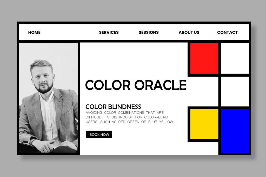
- Color Blindness: Avoiding color combinations that are difficult to distinguish for color-blind users, such as red-green or blue-yellow. Tools like Color Oracle can simulate how colors appear to color-blind individuals.
- Alternative Cues: Using additional visual cues, such as icons or text labels, alongside color to convey information. For example, using an asterisk to denote required fields in a form, in addition to highlighting them in a different color.
Conclusion
Color in web design influences emotions, establishes brand identity, enhances user experience, and drives conversions. By understanding color psychology, cultural differences, and accessibility, designers can create effective, engaging websites. Next time you visit an appealing site, notice the thoughtful use of color, and if you have any questions, feel free to reach out via the contact info on the webpage.